Mostrando entradas con la etiqueta Tutorial. Mostrar todas las entradas

sábado, 9 de noviembre de 2013

EOWYN Tutorial


ENG-This is part of a workshop I did for ImagineFX (issue 91) a year ago. I just realized I never shared the step by step with you, so there you go!
I´d say I´ve completely changed my technique within the last few months, but despite that fact. You still may find this tutorial useful and pick some tricks from it. If so, please help yoursef and do not hesitate to sharing it with your friends!

SP- Este es parte del workshop que hice para el numero 91 de ImagineFX hace un año y que todavía no habia colgado aqui.
Ciertamente en los últimos meses he cambiado bastante mi manera de trabajar, pero como eso tampoco quita que podais encontrar este tutorial interesante, aqui os lo dejo. Si os gusta no dudeis en compartirlo con amigos. Gracias!


ENG- Well,  so after reading the chapter from The Return of the King that features this scene, I started sketching a few ideas, trying to find a dynamic pose that features Eowyn as a main point of interest. I keep everything quite loosed as I won´t keep any of this when I paint it up.

SP- Bueno, pues antes de ponerme a hacer garabatos, le pegué un repaso al capitulo de El Retorno del Rey en el que salía esta escena para pillar el ambiente anímico que un poco describía Tolkien. Quise centrar la atención en Eowyn y dejar al Rey Brujo en segundo plano.
 ENG-After multiplying the line layer, I painted a gradient to ged rid of the white canvas. Again, despite these colors won´t be definitive, they are a good sample of which color palette I´m going with.

SP- Tras multiplicar la linea, trato de deshacerme del lienzo en blanco lo antes posible con un degradado. Los colores no son exactamente los que luego mantendré pero si que son una buena muestra de el tipo de gama por el que me voy a decantar.
ENG- I block the main silhouette to save time and start painting wide shapes of colour only using a few tones for now. Always mind where the light source comes from.

SP- Creo una máscara para la figura principal que me ahorre  tiempo pintando y empiezo a meter algunos colores sin entrar en detalle (siempre teniendo en cuenta de dónde viene la luz).
 ENG-In a figure portrait such as this, face will probably be your main point of interest. So I try to, somehow, lead all the elements in scene up to that point. You can use either shapes and edges or contrasts to that purpose.

SP- Desde un principio y como suele pasar, la cara iba a ser mi punto de interés, así que trate de algún modo que todos los elementos del dibujo dirigiesen la mirada hacia ella. Desde elementos físicos y formas a luces y sombras o contrastes evidentes.
 ENG-Once I´m happy enough with her face, I keep painting up her outfit. I try to pay attention to how light interacts with each material. Metal bits will have highlights and shadows while in her robes, contrasts won´t be that much obvious. I keep improving the values lighting the background and detailing her silhouette.

SP-Una vez estaba satisfecho con el resultado, continué con el vestido. Aquí traté de prestar atención a los materiales y el modo que interactuaban reflejando luz. Por ejemplo, los metales suelen crear contrastes y luces altas, mientras que las telas bastas no suelen ser tan especulares. Sigo trabajando los contrastes y añadiendo más detalles a la silueta.
ENG- For the floor, I use a mix of photo texture in soft light mode and a grass-shaped brush to create some nice textures. Also, I painted some elements such as the dead horse and the shield with the Rohan coat of arms on it to make some reference to the book story behind.

SP-Para el suelo, use una mezcla de foto texturas en luz suave con pinceles con forma de hierba. Además, pinte el caballo muerto y el escudo no solo para hacer referencia a la historia ilustrada, sino para ayudar a asentar el peso de la composición.

ENG-Time to detail the armor. I add some cool texture and golden trims to make the design more credible. details are always great, but will have make sure you don´t get lost into them without having some overall consistency, otherwise your painting would became cheesy. Think of the painting as a whole!

SP-Hora de añadir detalle a la armadura! Pinté textura en el metal y ribetes dorados para que el diseño pareciese más creible. Pintar detalles siempre resulta interesante, pero hay que andarse con ojo para no caer en lo superficial y cutre. Para huir de ello, trata siempre de tratar la imagen como conjunto.
  ENG-To paint the sword blade I use the polygonal lasso tool to make it sharp. Then is just about painting and blending the colours along the shape. The Nazgul in the background is another important element, not only for the story, but for the composition. I try to keep it contrast low, though, as I don´t want it to compete with the main figure.

SP- Para el filo de la espada utilicé el lazo poligonal que me permite trazar bordes cortantes. Luego simplemente es cosa de pintar y fundir los colores a lo largo de la espada. El personaje de fondo también es un elemento de importancia, no solo por su parte de protagonismo en la historia, sino por su función en la composición. Aun así, no quise forzar mucho los contrastes para que no acaparase demasiado protagonismo sobre la figura principal.

 ENG-For the sky I kept a flat texture that helped the main figure to pop out. In your painting you have to find a nice balance of everything: contrast, colors and of course textures. I have noisy textures in all the lower part and the figure seemed to grab enough attention. Therefore I didn´t want the sky to take that much notoriety.

SP-Para el cielo opté por una textura mas ligera que ayudase a la figura a destacar. Siempre intento buscar un buen equilibrio en mis pinturas, tanto de contraste, colores como texturas. Como la parte inferior era bastante rica en texturas, y la figura tenia suficiente información, no quise sobrecargar el cielo por ese mismo motivo.
 ENG-Hands will add some extra expressiveness to the figure, so spending some extra time painting them correctly may be worth.

SP- Las manos siempre son un buen elemento para añadir expresividad a los retratos. Invierte un tiempo extra pintándolas correctamente siempre puede ser beneficioso para la ilustración.
 ENG-In the last steps I keep adding some more details trying to get some textures right. I remember the hair took me quite a lot as I wanted it to look soft. There are some elements such as hair, dust or robes that can help you out to make your painting more dynamic. Play around with them until you get a correct effect.

SP-En los últimos pasos, sigo añadiendo más detalles para lograr una mejor apariencia en cada textura. Recuerdo que el pelo me llevo algo de tiempo para conseguir un efecto liviano al viento. Pelo, polvo y telas pueden dar un extra de dinamismo a tu imagen. Prueba a jugar con ellos hasta conseguir un efecto interesante.
ENG-Last tweaks were with soft  and overlight layers. I tried to enhance the light effect of the god ray coming from the right hand. That makes the scene to look more epic and romantic, as in the classic oil paintings.

SP- Los últimos retoques fueron con capas de Luz suave y Superponer. Intenté hacer más evidente el efecto de rayo de luz entrando por la derecha para dar un rollo más épico y romántico a la imagen, a lo cuadro al óleo antiguo.

viernes, 20 de septiembre de 2013

BLACK LEGION: Step by Step

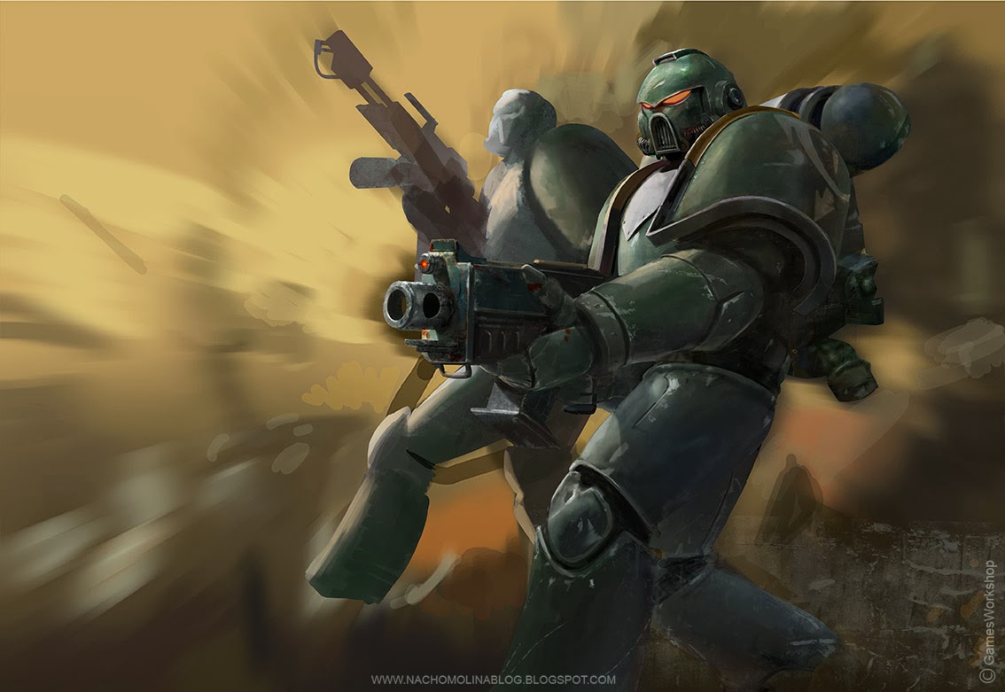
 This is a small tutorial of the process I followed to paint my latest Space Marines illustration. Although it may be a bit messy, I hope you enjoy it and find it useful.

Muestro aqui un pequeño paso a paso de mi última ilustracion de los Marines Espaciales. Puede que el proceso sea algo caótico, pero espero que lo encontreis útil en la medida de lo posible.
 1- I started off with a line sketch of a few generic Space Marines in battle. I wasn´t sure of any elements in the background, just wanted a main one holding a bolt and then a couple of the opposite army lying on the floor.

1-Empecé con un dibujo a linea de algunos Marines Espaciales genéricos en batalla. No tenía seguro que iba a poner de fondo, tan solo que quería una figura principal que ocupase la mayor parte del espacio y algún otro yaciendo en el suelo.
 2- I quickly painted a few tones to set up a colour palette and a main source of light. I quite like to blur the whole image before painting up everything to create some mood and not get distracted by so many brush stockes going on.

2-Rápidamente pinte unos cuantos tonos para establecer una paleta de color y una fuente de luz principal. Suelo desenfocar las imagenes nada mas empiezo a pintar para general algo de ambiente y a la vez no distraerme con demasiadas pinceladas o formas.
 3- I paint the main silhouette and block its shape so I can freely paint its armor and keep its edges sharp.

3- Pinto la silueta principal y la bloqueo para poder pintar libremente la armadura sin miedo a perder la forma acentuada de los bordes.

 4-After a while, this is how it looks like. I added some scratches and bumps to make it warner (painting metal is so much fun). Then I follow the same process with the second figure.

4-Tras un rato de trabajo, así es como queda. Añado algunas muescas desconchados para que parezca más desgastada (pintar muescas en el metal es lo mejor de la vida!). Luego sigo el mismo proceso con la segunda figura.
 5-Same here for the death guy on the floor. I wanted him to point with his claw to the main guy to create some visual rhythm as well as a frame for the background scene.

5- Lo mismo para el hombrecillo muerto en el suelo. Quería que apuntara con la garra en dirección al personaje principal para crear ritmo y un marco visual para la escena de fondo.
 6-That was a regret. I wanted to give the same importance to both armies but things seemed not to go in the right direction. Moreover, I couldn´t see any relation between the guy with the flamethrower and the one one in the background who was aiming at him. I just decided to turn his head  so they both would be facing each other. I started thinking of adding some flames to light the background and increase the contrast.

6-Esto es un arrepentimiento. Quería dar la misma relevancia a ambos ejércitos pero por ahora no parecía tal cosa. Además no conseguía establecer ninguna conexión entre el marine con el lanzallamas y el del fondo que estaba apuntandole. Finalmente decidi girar al primero y encararlo hacia los del fondo. En este punto empecé a pensar en añadir fuego también; ayudaría a iluminar mejor el fondo y a subir el contraste.
 7. The scene wasn´t still quite equal for both armies as the green army seemed to have some advantage. I decided to make things a bit more difficult for them and paint some sort of badass war machine in the background that act as a secondary focal point as well. I keep him with low contrast to keep it far off the viewer.

7. La batalla seguía sin parecerme equilibrada, así que se lo puse un poco más difícil a los de verde. Una gigantesca máquina de guerra dispuesta a aplastar cabezas me pareció suficientemente peligrosa y un buen motivo para captar la atención en el fondo.
8. Time now for the background, I tried to keep the upper part quite simple as I felt there was too much going on. The secondary sources of light helped to decrease the contrast and simplify some information in the background.

8. Hora de pintar el fondo. Mantuve la mitad superior bastante simple ya que me parecía que el dibujo empezaba a estar algo recargado. Las luces secundarias del fuego ayudaron a simplificar algunas zonas de las figuras y el fondo.
9. I added a soft light layer to balance the colors and make them more according to the scene, a reddish kind of hellish atmosphere was what I wanted.

9. Para equilibrar los colores, añadí una capa de luz suave con un tono rojizo que me diese el tipo de atmósfera infernal que buscaba.
10. Finally, I added a few details here and there to make them all as if they were turning into chaos. I also blurred some parts to enhance the feel of dept.

10. Por último, añadí algunos detalles en las armaduras para sugerir que ambos ejércitos empezaban a mutar al caos. También desenfoqué algunas partes del fondo para enfatizar la sensación de profundidad. 

martes, 5 de febrero de 2013

EOWYN VS THE WITCH KING Videotutorial

Imagine FX has uploaded on his Youtube Channel the video-tutorial I did for the issue 91. Hope you find it useful!

sábado, 8 de diciembre de 2012

EOWYN for IMAGINEFX'91

ImagineFX celebrates The Hobbit coming out next week with an special issue dedicated to J.R.R Tolkien. Artists such as Donatio Giancola, Justin Gerard, Alan Lee or John Howe among others will explain along each tutorial their work-process and some tips to make the work easier.
This issue also includes a workshop of mine, made up of a complete tutorial, the "step by step", some brushes and a video recording the process of painting this illustration of Eowyn. I based myself on her fight against the Witch-King at Peleanor's Fields from The Lord of the Rings... But if you want to learn more about, get the magazine as it's available since last November the 7th.
I hope you like it and find it useful.

Aprovechando el estreno la semana que viene de El Hobbit, ImagineFX ha lanzado un número especial dedicado al maestro J.R.R.Tolkien. Artistas tales como Donato Giancola, Justin Gerard, Alan Lee o John howe entre otros explicarán a lo largo de cada tutorial su proceso de trabajo y algunos consejos para hacer el trabajo más sencillo.
Este numero además incluye un workshop mío compuesto por un completo tutorial, el paso a paso, algunos pinceles y un video del proceso de esta ilustración que pinté especialmente para la ocasión. Me basé para ello en la lucha entre Eowyn y el Rey Brujo en los campos de Peleanor de El Señor de los Anillos.  Pero si quereis saber más al respecto, mejor haceros con la revista que esta a la venta desde el pasado 7 de Noviembre.
Espero que os guste y la encontreis interesante.


miércoles, 29 de agosto de 2012

"I BATALLA POR EL MURO" in MADRID, INTERVIEWS, PUBLICATIONS AND STUFF

ENG-A lot of news coming up. First of all, I am happy to announce next September 22- 23 I will be in the "I BATTLE FOR THE WALL"in Madrid, where players from all around Spain will gather to face up to each other in a Game of Thrones card tournament. I will be there having a good time while signing cards, doing some sketches for you and sharing some funny stories about how working in illustration is like. Additionally, each player will receive as a present an special card of the coat of arms of their house designed by me for that particular occasion and the best ones, other gifts such as signed prints or original sketches .

SP-Noticias a la vista! El próximo 22 y 23 de Septiembre estaré en Madrid firmando cartas, haciendo dibujos y pasando un buen fin de semana con los participantes de la I BATALLA POR EL MURO, un evento que reunirá jugadores de toda España para batirse en duelo  en un singular torneo a cartas de Juego de Tronos. Cada participante recibirá como obsequio una carta con el emblema de su casa y los mejores regalos como láminas firmadas o bocetos originales.

ENG-So If you are interested in taking part in the event or just pop in there, you can find some information in the website. I hope to see you there.

SP-Así que si estais interesados en participar o simplemente pasaros por allí podeis encontrar toda la informacion en la web del torneo. Espero veros por Madrid!


ENG-Moreover, I was interviewed on CREATIVE-PHLARE.COM, where you can find as well my TRANSLATED LORNA STEP BY STEP's TUTORIAL

SP-Además, hace unas semanas hice una entrevista para CREATIVE-PHLARE.COM, en donde podeis encontrar más material mio, como el TUTORIAL DE LORNA traducido por fin al inglés.


ENG-Besides, IMAGE COMICS has introduced its new NANCY IN HELL (ON EARTH) TP which will be available on October 24, 2012. The comic book is made up of the first 4 issues. Art by Enrique Lopez Lorenzana, written by El Torres and cover art by me.

SP-Paralelamente, IMAGE COMICS ha anunciado su nuevo NANCY IN HELL (ON EARTH) TP que estará disponible a partir del 24 de Octubre de 2012. El comic esta compuesto por los cuatro primeros números de la serie. Arte de Enrique Lopez Lorenzana, guión de El Torres y portada mía.

ENG-And finally, this are some samples of the work I did for World of Warcraft TCG: Tombs of the Forgotten. Blizzard and Cryptozoic has been keen to me and sent me again a massive among of cards. Thank you guys.

SP-Y finalmente aquí una pequeña muestra del trabajo que hice para World of Warcraft TCG:Tombs of the Forgotten. Los chicos de Blizzard y Cryptozoic han sido majos y me han mandado un monton de cartas para la colección. Muchas gracias!

lunes, 2 de abril de 2012

1st TOURNAMENT A Game of Thrones-ZARAGOZA

This weekend has been celebrated the First Tournament of A Game of Thrones LCG in Zaragoza (Spain). Spanish players from all around gathered for competing each other in the card games. The winner of the event received a print of the illustration I had painted for the tournament, and also a commemorative card with the same image.
I did not have so much time but I decided to paint it using a mixed technique consisted on pencils, grey markers and photoshop in spite of not being my usual technique. Not only was the result faster, but also I had the opportunity to try different things with the oil brushes of the Photoshop CS5. You can see the step by step here below.


domingo, 19 de diciembre de 2010

LORNA Step by step

ENG- This is a tutorial about how I did the Lorna's illustration. There are some comments attached to each step.

SP- Posteo aquí un paso a paso de la ilustración de Lorna con algunos comentarios al pie de cada imagen.

ENG-Step 0: Before starting, I usually spend some time trying to work out a cool composition or image with certain interest. In this case, I wanted to depict Lorna, who as you know, is a character that combines sensuality with a kind of Sci-Fi adventurer. I came up with a few ideas, but in all of them Lorna was sit or laid with her spaceship as a background.


SP-Paso 0: antes de ponerme a pintar algo suelo aguardar un rato para tratar de imaginar una imagen/composición  que pueda tener cierto interés. En este caso quería pintar a Lorna que como todos sabéis es un personaje que se caracteriza por una alta dosis de erotismo y sensualidad con un toque aventurero del tipo Sci-Fi del espacio exterior. Se me ocurrieron varias ideas pero todas ellas tenían como factor común a nuestra querida protagonista en una pose de reposo, tumbada o recostada y con algún fragmento de su nave espacial de fondo.


ENG- Step 1: Firstly, I tried to draw a line sketch as much precise as I could to work under it. Although I hadn't the foggiest idea about how to do the background, I did know that the main character was going to occupy the most part of the room. At the beginning, she was thought to lay naked but with earrings and guns. And moreover, I wanted the hair to make up a sort of Mucha arabesque, which always works when we paint girls.


SP-Paso1: En este primer paso traté de hacer un dibujo a línea bastante preciso dentro de lo que cabe sobre el que poder trabajar. No tenía claro en absoluto qué iba a poner de fondo pero me interesaba que la imagen de la protagonista abarcase bien el formato  vertical dentro de lo posible. En un primer momento quise que yaciese totalmente desnuda con las pistolas y los pendientes como único complemento y jugar con el pelo intentando dibujar algún arabesco Muchesco  que siempre queda bien cuando se pintan chicas.

ENG- Step 2: I started messing around with lights and shadows trying to set the lights from above on the right, which leads to the leg being in shadows and having the focus of the image on the face and chest. Incidentally, the general tone is more orange than in the final image. However, this step was only for set up some chiaroscuro.


SP- Paso 2: Comienzo a manchar con luces y sombras probando un tipo de iluminación desde arriba a la derecha para tener toda la pierna en sombra y que el foco principal y punto de interés sea la cara y el pecho. Como podéis ver la gama ahora mismo es muy naranjosa con respecto al final pero tan solo me interesaba crear algo de claroscuro.

ENG- Step 3: I change the color balance of the whole image using a magenta soft light layer. Now everything was more pink, which has much more sense when it comes to depict the sensuality, the female body, etc.


SP-Paso 3: Aquí le doy un tinte distinto con un equilibrio de color y con una capa de luz suave magenta y llevo toda la imagen a una gama de rosas para que tenga una connotación más femenina y sensual toda la imagen y sigo pintando en base a esta nueva gama cromática
ENG- Step 4: This one was just a dark color to bring the figure out to the front. I still hadn't an idea about what to paint in the background.  My first attempt was with Matias (Lorna's robot) in a funny pose such as grabbing her leg in a helpful attitude. But I end up rejecting it since there wasn't too much space left and I didn't wanted the image packed with too much information.


SP- Paso 4: Esto simplemente es un color oscuro de fondo para ver cómo puede funcionar. No tengo todavía muy claro que puedo poner de fondo y sobre que puede estar sentada Lorna. En un principio pensé que estaría bien  que Matías (el robot de Lorna) estuviera a su derecha en alguna pose graciosa (agarrándose la entrepierna, en actitud servicial  o algo así) pero terminé descartándolo porque no veía claro que cupiese en el espacio libre y tampoco quería que agobiase

ENG- Step 5: Lots of new stuff here. On the one hand, background has become several blurred purple tones, which gives some deep to the image. Moreover, I come up with the idea of painting some screens  that surrounded the girl creating a kind of perspective. The screens could contain references to Azpiri (the original Lorna's creator) as well. 
On the other hand, I wasn't sure at all that a complete bare figure worked well. Therefore I decided to dress her in dressing gown and high -heeled boots. I think it was a good decision not only due to the variety of textures coming up (flesh, hair, fabrics, leather), but also because the two guns and the boot made up a quite interesting triangle that matched perfectly with the composition. At that point, I started to thinking about painting the hair going up.


SP- Paso 5: Aquí hay muchas novedades. Por una parte el plano morado del fondo se ha convertido en varios tonos que aunque no describen nada le dan algo de profundidad a la imagen (en realidad son unas cuantas pinceladas y planos desenfocados), sobre estas se me ocurrió la idea de pintar unos monitores en perspectiva que envolviesen a la figura por derecha e izquierda, estos podrían contener imágenes varias que hiciesen referencia a Azpiri y reforzar también esa sensación de tiro de cámara en contrapicado. Por otra parte no terminaba de estar seguro de que funcionase del todo bien una Lorna desnuda así que se me ocurrió “vestirla” con su batin y las botas altas. Aquí podeis ver este paso muy basto pero suelo hacer anotaciones rápidas sobre la imagen para ver yo mismo si funcionan o no antes de pasar a pintarlas mejor. Creo que funcionaba mejor así por tener más variedad visualmente (carne, tela, cuero) y las dos pistolas con la bota dibujaban un triangulo compositivo bastante interesante.
Aquí también empiezo a considerar si quedaría mejor pintar el pelo hacia arriba en lugar de hacia abajo.
ENG- Step 6: I make up my mind and started to detail the dress and the hair trying to keep the rhythm of the image with the wrinkles.


SP- Paso 6  Me decido por este modelito y comienzo a pintar arrugas verticales sobre él para seguir un poco el ritmo de la figura, a sacar sombras sobre esta, etc.
ENG- Step 7: Since was getting upset with so many color stains, I tried to simplify the hair. I imagine it like something light and diaphanous. So I did it, and as a result we had a nice bend which keeps on the line of the boot and the body. Composition is always important!


SP- Paso 7 Como empezaba a agobiarme con tanto mamarracho intento sintetizar la zona del pelo para que tenga un acabado algo más limpio la imagen, pensé en hacer el pelo como algo vaporoso pero que siguiese una curva a derechas para que visualmente acompañase el cuerpo y la pierna, también pongo la imagen de Mot en plan salvapantallas.
ENG- Step 8: After adding some textures I remember I started to feel tired and lazy, I though about paint some foreground in order not to paint all the fabric wrinkles and at the same time, bring up those Mucha's shapes I didn't paint since I change all the hair. However, as I wasn't sure about this decision, I painted everything on a separate layer.

SP- Paso 8 Aquí pinte algún plano más cortante en el fondo y alguna textura.  Recuerdo que aquí empecé a agobiarme con lo de la tela así que pensé a ver si metía algún plano en contraluz en plan silueta de cables para tapar parte de la túnica y así en parte evitarme pintar arrugas y volver a esos dibujos Muchescos a los que ahora había prescindido por pintar el pelo hacia arriba. No tenía esto muy claro así que lo trabajé en una capa aparte.
ENG- Step 9: I end up bitting the bullet and painting everything instead of choosing the short path. I think was worth such invest of time and effort since at that point, I had a clearer idea of how to continue the illustration.


SP- Paso 9 Aquí le eche valor y me puse a pintar arrugas y pliegues en  la tela y la bota en vez de tanto cable facilón.  Creo que el trabajo mereció la pena porque acabado este paso ya tenía todo mucho más claro y por dónde seguir…

ENG- Step 10: This one come as unexpected. I decided to stain the color fabric with a pink-overlay lay. The image works better, specially in the shadow, which seems to be more pink instead of the previous green. I continued by stressing the high lights and its blurred glow. That effect was quite interesting since suggested a kind of sexual power, energy, mojo or whatever you wanted to call it, coming out of Lorna.


SP- Paso 10  Esto no lo tenía previsto pero se me ocurrió teñir toda la bata con un color rosa superpuesto  y creo que funcionaba mejor que el blanco roto de antes (sobre todo en las sombras que antes parecían verdes), intenté forzar más ese efecto de vaho o desenfoque tratando de hacer las luces más radiantes. Esto le da a la imagen un aspecto interesante ya que me sugería que la protagonista irradiaba algún tipo de energía, mojo, poder sexual o como queráis llamarlo.
ENG- Step 11: I set some images on the screens in blue tones in order not to have pink tones everywhere. The background images, by the way, are Mot's wallpaper I painted some time ago, a screenshot of an Spectrum game; Matias, Lorna's robot speaking on Skype and screenshot of my blog (long live self promotion haha).


SP- Paso 11 Coloco las imágenes en los monitores de fondo intentando con modos de luces altas y azules y trato de meter variaciones de tono leves para no saturar tanto de rosas la imagen. Las imágenes de detrás, para los curiosos,  son el Wallpaper de Mot que pinté hace un tiempo, una captura de pantalla de un juego de Spectrum, Matías el robot hablando a través de videoconferencia y una captura de pantalla del blog (viva la autopromoción jajaja). Como veis sigo algo obcecado en ese primer plano silueteado de cables porque tampoco acabo de ver clara tanta tela por esa zona.
ENG- Step 12: I detail the face and paint some interesting shapes all around the hair in order to have a different visual texture from the other surfaces of the illustration. As I couldn't come up with any better idea for the cables, I leave then as you see. It is a horrible sofa design indeed, but since it was a secondary part of the drawing, I thought it wasn't too much important at all.


SP- Paso 12 Trato de detallar más la cara y el pelo intentando hacer algún dibujo gracioso y que visualmente tenga un tratamiento distinto a la piel y las telas de Lorna y meto más detalle a la cara. Pinto un par más de monitores con un plano-esquema de la Galaxia y dejo más concretados los cables del fondo. La verdad es que el tema de los cables me tenían un poco harto así que los pinté un poco al tun tun y los dejé en plan diseño feo de la cama pero como eran zonas secundarias de la ilustración pensé que tampoco pasaba nada si se quedaban así.

ENG- Step 13: I made a point of the glow in the drawing as I didn't wanted to lose the warm and humid atmosphere. Additionally, I lighten the skin of Lorna, specially in the shadows in order to look it paler.


SP- Paso 13 Pues intento extender esas luces altas para no perder esa atmósfera tibia /húmeda de la que hablábamos antes y aclaro la piel porque me daba la sensación de que las sombras estaban muy oscuras.
ENG- Step 14: I painted hands and guns and after some failed attempts of designing some big and cool earrings, I end up painting that simple ones and putting a couple of hair ringlets instead (I know, I'm so seedy)


SP- Paso 14  Pinto las manos y las pistolas y tras varios intentos de hacer unos pendientes chulos y fracasar en todos ellos opto por dejar estos más sencillos y adornar el cuello con un par de tirabuzones (que cutre soy jajaja).
ENG- Step 15: More pink glow and concretion in the crotch area without too much detailing (one should know when stopping). Apart from that, I solved the foreground by a couple of silhouettes which frame the scene with no detail (I just wanted it to compose, don't ask me if they are pillows or stuff because I don't know)


SP- Paso 15 Aquí metí más halo rosado y concreté la zona de la patatique sin entrar tampoco en mucho detalle (hay que saber tener un límite). Aparte de eso,  terminé solucionando ese primer plano con un par de siluetas que enmarcasen la escena sin entrar en mucho detalle (solo me interesaban para componer, no me preguntéis si son cojines o cacharros porque no lo sé)

ENG- Step 16: Some final details and changes in the leg's shadow which seemed to be quite weird (Still now, I'm not complete sure wether it looks nice). Finally I add some adjustments of brightness and contrast before finishing it.


SP- Paso 16 Meto algún toque final más y resitúo un poco la sombra de la pierna que me resultaba un poco inconexa (no acabé seguro del todo de que estuviese donde debería , pero bueno…). Finalmente le metí a la imagen los típicos ajustes de brillo y contraste antes de darla por acabada.
ENG- And that's all folks! As you see, although I start with clear ideas,  I usually improvise and change thinks along the trip. Everything comes down to what the image needs.
I hope you like and find it useful. Merry Xmas to all of you and thank you for visiting the blog ;)


SP- Y eso es todo, como veis, aunque parto de ideas claras soy bastante de ir improvisando y cambiando cosas a medida que me lo va pidiendo la imagen o se me van ocurriendo. Aun así espero que os haya gustado el proceso y aprovecho para felicitaros las Navidades a todos los que os dejáis caer por aquí ;)